A year ago I moved from working in academia and global health to big pharma. A move that I was warned would make it difficult to ever return to global health, and kind-hearted jokes were made of selling out to become a corporate tiger. Ggrrrr…
So it seemed fair that I was asked in the interview, “Why the shift?”. Yet, naively, this question took me by surprise. Can you throw your arms in the air and exclaim, “Mid-life criiisssiiiss!!”, in an interview? See, with this new role, I planned to draw a distinct boundary between my work life and my home life. A boundary I’ve always struggled to draw and consistently blamed the circumstances.
It’s me.
What I’ve learnt in this last year is that it’s me. My PhD supervisor once advised me to get a 9 to 5 routine – an idea I scoffed at. More than 10 years on, I thought I could finally obtain this attitude. I cannot. Not just because I struggle with routine, but because brain-tickling work will always grab my attention like a squirrel to a dog, or like a dog to me. I sparkle when trying to nudge something un-understandable to understandable-ish; hopelessly yabbering about it during social events when I should be engaged in the conversation about taxes and interest rates. Even though many of my friends are ex-colleagues who will listen to me break down some analysis that’s captured my brain, work conversations are undoubtedly better had with actual colleagues!
Valuable colleagues.
It’s wonderful to have colleagues who provide scope to mentally meander, and yet keep you from straying too far, “What if we thought of it like that… that would mean this… and does that cause a problem here?”. So it’s very sad that we recently experienced a tragic loss of such a colleague who unexpectedly died at a young age. This is new territory for me. To experience a crash of grief during a meeting when discussing something as mundane as ID numbers of projects takes me by surprise. Then again, I am consistently surprised at how strong grief is, and how effected I am by this eternal fact. But, from grief in my personal life, I am trying to relish that this sadness is because this colleague meant a lot to me. So what can I learn from this?
Work life.
People at work mean something to me because, with them, my brain is encouraged into a gear that nourishes my being. A gear where we break down problems to the key components, and seek solutions, and assess the limitations. With the departure of this colleague, a reference to her as a “sparring partner” has come up repeatedly. I like this description a lot. I go to work to spar! And since this is something that my mind is constantly craving, I no longer seek work/life balance. I seek brilliant colleagues. Colleagues whose deaths would make me deeply sad because a wavelength that my brain could tune into has gone forever. Try explaining that in an interview!
Personal life.
From this last year, I’ve learnt to accept my blurred work/life balance. Nonetheless, this blurred line has shifted because I still hold strong that my academic days are over. This loss makes me sad. But my mid-life crisis has meant that I also want more time to do things I should do: learn French and learn to ski; and many other things I already love to do: hanging out with my niece and nephew, aerial hoop, painting, mountain hiking, scuba diving, acroyoga, and on and on.
The joys of a mid-lfe crisis. Or as the HSBC advert says, “mid-life opportunity”.
I live in Geneva. I struggle to live in Geneva! My French is terrible, the administrative systems are challenging to navigate, I’m a vegan in the land of milk and cheese, and generally I confuse the locals with my Mr. Bean demeanour. Yet I love the international atmosphere here and expat life. I think some of us are born with itchy feet, and over the years, it’s become easier for us to follow our itchy feet. More and more people have accents that don’t match their skin colour – which is a delight!
Mauritian Dad
My Dad’s parents immigrated to Mauritius from China, to seek their fortune. They set up a shop on a sugar farm, selling groceries to the workers. His mother spoke Hakka, a Chinese dialect, so this was officially my Dad’s first language. But at school he learnt English and French, and spoke Creole with his friends and nine siblings. In the evening he would help his Dad in the shop. He sat atop a giant stack of old newspapers from the UK, and would fold the papers into small containers for produce to be sold to customers. But he would get distracted as he marvelled at the seemingly endless stories within these papers. So much was happening in these far off lands! So at 19 he set off and moved to London. After the sharp shock of the first winter, he settled into his life, relishing in the starry lights of London.
Kiwi Mum
Meanwhile, in New Zealand, my mum’s family were packing up their things to move to London. My grandfather was originally from London, but left at aged 11 as an evacuee at the beginning of WW2. He was sent to Monmouth, Wales, where his sister always remained. But my Grandad also had itchy feet. Towards the end of war he was in the Merchant Navy. During a short trip to Auckland, he met my grandmother. Three days later when he had to depart, he proposed. As soon as he could, he returned to New Zealand and they married and raised my Mum and her two brothers. But of course, itchy feet! There’s never that, “We’ll stay here forever now” feeling. So when my Mum was 18, they all went to London.
The melting pot
At a party one day, they met. My Dad was drawn to this beautiful vivacious woman, who like him, sought something a bit different. My Mum fell for the quiet, exotic looking Chinese man, “with fantastic hair”. As those who build a life with someone from a different culture know, it’s not always easy, but they made it work. And being from mixed backgrounds seeped into my identity. As a child, when we saw a map or globe, my Mum would make us point out where she was from, where my Dad was from, and where I was born. It always marvelled me – the sheer distances.
My rich life
My parents provided abundant richness to my life in their own ways. My mum was stern and loving – and always encouraged me and my siblings to be whatever we wanted, as long as we were good people. Not imposing lifestyles on us may have been a strategic act of rebellion from a linage of stereotypical Jewish mothers! Nonetheless, whatever the motivation, her attitude was gorgeous. And even more appreciated when I saw that she struggled to keep at times – especially with her desire for an army of grandchildren!
My Dad, a lone accountant ran his own small business, focused on working every hour he could to finance the costs of raising of four children*. “As soon as the money came in it went out again!”. Accounting wasn’t my Dad’s passion. It served a purpose – providing for us. We were his passion.
Like a true spoilt child, I’ve greedily lapped up everything I could from these attitudes. I’ve followed what my passions are (maths and data!), to become highly educated, with the privilege of seeking work based on what make me happy. So now I sit in this hyper-global city, sometimes feeling on top of the world, with enough money for a great life, and surrounded by fascinating people. All of this, not just because of the parenting I received, and the lucky hand of genes I inherited, but because of life decisions my parents made – because of their priorities and their itchy feet. I relish being a spoilt girl with it all! And I’m eternally grateful to my parents for giving me everything.
*I acknowledge, as a Boomer with an aptitude for maths, my Dad had significant economic advantages. Nonetheless, it was also a time where it was an unquestioned fact that as an outsider, he would never be promoted past a junior position in a large accounting firm. So even if the economy now makes a single income household with four children a near impossibility, some things get better.
As a kid, I enjoyed gymnastics. Then I saw a home video (an early 90s style video) of me partaking in a group performance. I was mortified as I saw for the first time what I looked like. I remember how I felt when doing the moves I was watching. I felt elegant like the other girls in the class. No! I felt MORE elegant. But I was not! I’m out of time. I’m flinging my limbs and back around. I’m over arching, over flaying. An onlooker must have wondered whether this child was possessed by a baby goat! In that moment I realised that what I felt in my body did not resemble the movements displayed to the world.
Upon this realisation, I lost enthusiasm for gymnastics and avoided anything that required hand eye coordination. “You’ve got your grandfather’s genes”, I’d be lovingly told when I bumped into a door frame. “He’s clumsy too.”. As we all do, I learnt to accept my limitations. During my adolescence, I laughed along, “Yea, I’m okay!”, I’d reassure others as I’d dust myself down. “Bums are for landing on!”
And being comically clumsy is great for others around me, should you be a fan of slapstick humour. I’ve bitten my finger, painfully hard, multiple times from eating too quickly. I’ve called for help from a stranger in a changing room because I’m stuck in an item of clothing so many times I’ve become numb to its embarrassment. And I swear, sometimes my phone magically leaps out my hand.
Being upside down
Despite struggling with movement the right way up, I love being upside down. I would see a circus show and get obsessed with learning everything I saw! I have practiced for years and years and years. Mostly at home because yoga teachers seemed stressed! Encouraging me to practice against a wall, or to, “be more patient and slow down – don’t just throw yourself”. PAH!! I didn’t care about falling over – I’m always falling over!
Now my headstand is incredible! My forearm stand is pretty good. And my handstand is sometimes there for an exhilarating second or two.
Then two years ago I started learning aerial hoop. I’m strong and flexible, I thought. I can do this!
Being the class dunce
A few weeks of aerial hoop classes and I wanted to quit. It’s hard to find the motivation after a hectic workday to go to a place where I struggle to understand the language (it’s in French), and I feel embarrassed and impatient as I’m shown simpler moves than everyone else, and on a hoop that’s much lower. But instead I doubled down. I got a hoop installed at home. I took months to confess this advantage to other people in the class because I didn’t want them to know that even with extra practice at home, I’m still this bad! But time goes on. New people join. And sometimes they’re initially worse than me. Meanwhile I only get better.
Despite knowing I lack coordination, when the teacher shows a new move, I race to be the first one on the hoop, thinking, “Yea! I can do that!”. That delusional girl who believed she was the elegant girl in the gymnastics class is still there! Then three seconds later, on the hoop, and I can’t recall a single move that the teacher did. I’m watching my video of the teacher over and over – frustrated that trying to solve this puzzle is beyond my abilities.
After months, the video watching is replaced with patient direction from other students. It takes a small team to build my body awareness! They give me a lot of extra coaching. ‘That’s right – now put your arm there – your other arm – not there – not there – yes there!”. I can’t tell my left from my right – having to look at my limbs and remembering that I only have tattoos on my left side. Then, when I do get it, the studio briefly fills with cheer and relief!
Being amazing!
Part of learning the aerial hoop requires videoing yourself. I resisted this for nearly a year. Fearful that seeing videos of myself on the hoop would pollute my enjoyment with self-consciousness. But now I’m used to these videos. And now, sometimes when I watch myself, I can’t believe how graceful I seem. I’ll narcissistically watch these clips over and over and spam friends and family with the videos and comments, “LOOK!! LOOK AT HOW AMAZING I LOOK!!”
Other students in the class get a move after one to five attempts. Of course this comparison makes me jealous. But above all, I friggin’ love learning what I can do. And everyone is kind and encouraging as we each take on our own battle – whether it’s strength, flexibility, loosening up, coordination, courage to try a drop, or handling the nausea of spinning. We’re each battling our own limitations – and then we do it! Go us!
Being me
I’m still clumsy. My lack of spatial awareness will still unfailingly crack people up unexpectedly. But for a few minutes a week, I look graceful, and I have video evidence of these glorious achievements!
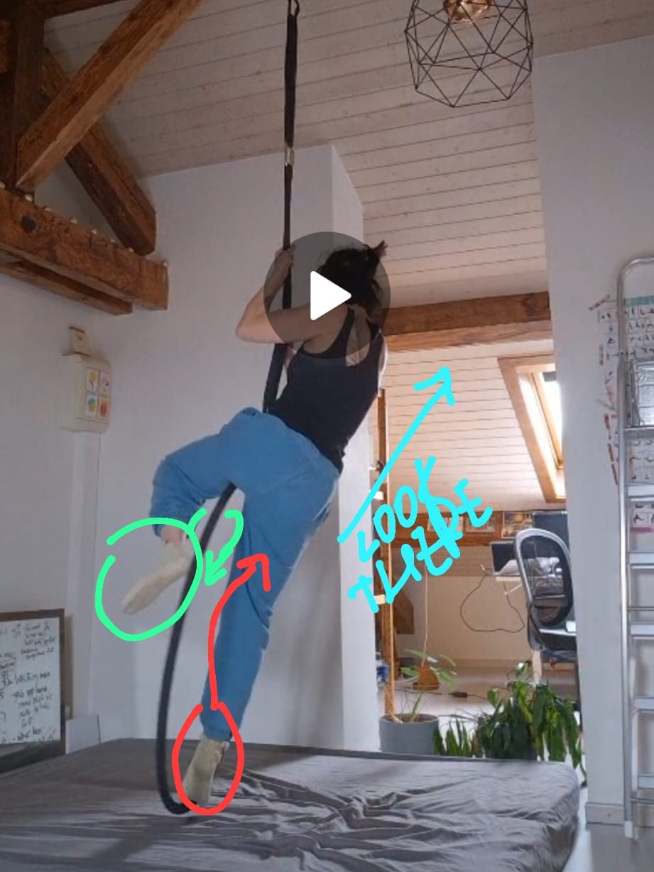
Learning this move took two hours in a workshop, private practice at home, an hour private lesson, and more practice. Then I got it. Finally! (On one side.)
The photo is a screenshot from a text conversation with a Hoop Friend who adorably tried giving me direction when I sent videos of my fails.
### AI note: Despite my prolific use of Chatgpt, this article has not seen an AI enhancer.
This catchphrase is dangerous. As a lover of digging into datasets to uncover the stories, this ubiquitous catchphrase irks me. Data cannot capture the full story, and expectations that it can polarizes people.
Reality is beautifully complex with infinite connections and nuances that, to replicate, needs both an infinite amount of data and an infinite number of analysis monkeys. Stating that decisions should be based on data gives data analysis a bad name.
Mathematicians do not rule the world
People in power need to lead, inspire, negotiate, and be diplomatic. It is not necessary to know about Bayesian probability to succeed in their role. In fact, mathematicians have a bad rep at schmoozing. (How can you identify an outgoing mathematician? They look at your shoes instead of theirs.)
It is not just people in power. Most people do not have the kind of training to intuitively understand mathematical models or statistical analysis. And yes, it would be great if everyone did. But that’s not going to happen any time soon. And whether we all could is a conversation for another blog entry.
Most people I’ve met recognize the importance of maths models and data analysis (albeit my sample is very biased!), and they’re willing to listen. But if the results suggests something that is against their known reality, it discredits maths models and data analysis.
This disconnect in a vital part of the process, and it not acknowledged for the necessity and enlightening process that it is. Actionable insight is a team effort across different experts. Give me a dataset and I can happily play with it for hours. But my real joy comes from creating something with people who know about the reality – I learn from them and in turn we both learn from the data.
Let’s create something beautiful together!
Imagine water flowing on the ground. There’s not rocks nor anything to guide the water flow. I see my role as creating a form from this. I talk to people to learn, “Oh this isn’t possible? Okay, I’ll put a rock here so the water can’t go there.”, “Oh this is an important dynamic? Okay, I’ll dig a trench here to make sure these components are connected.”. Not every sculpting effort will be perfectly placed initially. But as a joint project, we can create an elegant water feature that takes us from A to B. And in my fortunate experience, this process engages and captivates everyone involved.
Towards a future with “Data informed decisions”
Let’s update the catchphrase! Any model, any analysis, is not a blueprint. It is only information. Information that cannot be obtained any other way. So it is vitally important. Moreover, the learnings gathered during this creative collaboration mean that critical thinking is slowly but surely permeating into decision making systems, which benefits us all! And at the end of the day, I’m not saying anything new. ‘Evidence-based practice‘ has been championed since the 1970s and 80s (by an epidemiologist no less).
Below is a post written by Shweta Sharma, a Masters student from May 2020 to July 2021 whom I supervised at the Swiss Tropical and Public Health Institute.
Take it away Shweta!
It’s spring of 2020, and I am starting my masters thesis under the Disease Modelling Research Unit at Swiss TPH. Everyone is talking about COVID-19, but I will be talking about malaria! With Tamsin, I will investigate drug resistant malaria in India.
It seemed like a perfect and easy topic for me. I am from India and being with a medical background, it would be is easy for me to understand everything.
But… there is much more. There is geography, mathematical modelling, and coding.
“It’s easier to resist at the beginning than at the end.” – Leonardo da Vinci
Malaria parasites develop mutations that lead to resistance to antimalarials. India treats malaria with Artemisinin plus Sulfadoxine-Pyremethamine (SP), which requires the parasite (Plasmodium falciparum) to develop at least five mutations before the drug is no longer effective. The World-Wide Antimalarial Resistance Network (WWARN) has gathered 652,83 samples from 180 publications from 62 countries to map where SP drug resistant mutations have been detected. I used their data for India for my thesis.
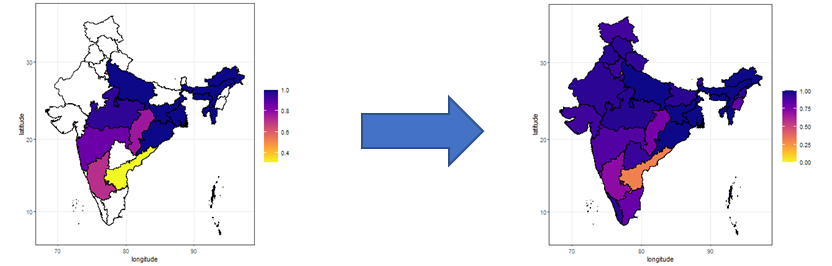
Not all states in India have data on SP drug resistance. So, we consider factors that are associated with antimalarial drug resistance, and make predictions for the states without data (using regression analysis). See the map below, which goes from partially coloured to completely coloured.
From countless to countable
There are countless factors associated for drug resistance (predictor variables). To make an initial selection of ‘predictor variables’, I read. A lot. (I love doing literature reviews. You read and learn, read and learn). I learnt that socioeconomic factors are a big driver of drug resistance in India. For example in rural areas, Unlicensed Medical Practitioners (UMP) are preferred for seeking treatment and they do not follow the national malaria treatment guidelines. I settled on 44 predictor variables that covered socioeconomic factors, epidemiological factors and health infrastructure. I collected data for these variables, at the state level, from different official sources in India.
To choose which of these 44 predictor variables are the most relevant, I used combinations of two or three predictor variables in a regression model to predict the presence of drug resistant malaria for states where we know the level of drug resistance. And as a control model, I also used random values as predictor variables (the null model). The combination of predictor variables that gives predictions that most closely match the actual data are the winners.
States with low socioeconomic status are more likely to have drug resistant malaria
The three most accurate combinations were, in order:
1. Average population per government hospital and per capita income
2. Average population per government hospital and gross enrolment ratio (Gross enrolment ratio is the ratio of enrolment in higher education to the population in the specific age group. In the data I used the age group between 18 to 23 years for both genders.)
3. Average population per government hospital and the percentage of the population that lives in a rural area.
Average population per government hospital is very important as rural and urban areas have disparity in terms of the quality of health care services. Rural health centres are overburdened resulting in compromised quality of care. Combining this variable with a socioeconomic factor, makes the predictions more accurate than using the average population per government hospital as the only predictor.
From data to predictions
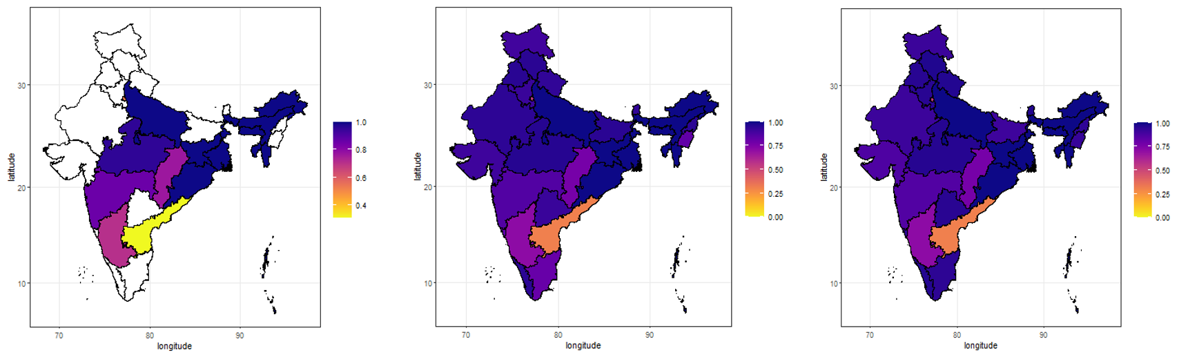
The predictions don’t match the data exactly, clearly seen with Andhra Pradesh state (yellow on left map). However, the predictions are overall very close to the data, and we can fill in information where we don’t have data.
What I learnt
Thesis – I completed my master’s thesis and learnt that socioeconomic factors are predictors of the presence of drug resistant malaria.
Geography – Now I can spot all Indian states on a map 😛
Maths – I can understand big equations better.
Coding – I can make pretty maps in R.
Tamsin, I will be grateful always for what I have learnt from you…you are an amazing person and a great mentor !
Imagine there’s a new disease. Quickly, stock up on loo roll! But whilst we panic, the powers that be throw money at the problem (whilst, presumably, also panicking). Then knowledge grows and miracles happen.
Miracles happen because we invest in learning
The ‘learning curve‘ is the line that shows how knowledge increases with experience. For this blog post, I’m going to replace ‘experience’ with money, meaning that as more money is invested, more knowledge is gained. (In maths terms, “For disease management, assume experience is proportional to the amount of money invested”.)
The learning curve: Investing in learning about a disease leads to a greater understanding about how to manage and treat it. This ultimately leads to elimination of the disease, or at least stable management so that it is ‘under control’. New diseases occupy the left side of this curve. As we invest more, we move to the right so we learn more, thereby managing the disease better and reducing the number of diseased people. (Maths: This is the Sigmoidal growth curve 1/1+exp(-ax) for a = 1 and x = [-5, 5]. Changing a changes the shape of the curve.)
The Knowledge here (capital K) ranges from all scales of understanding that is needed to eliminate a disease: from the small biology stuff, to the development and production of tests, treatments, and vaccines, to mathematically modelling individuals’ behaviour, to delivery of equipment and medicine, and to provision of care throughout the at-risk population. The goal is to obtain aaaallll the Knowledge (maximum Knowledge). (Maths note, Knowledge is a dimensionless parameter, where the relevant aspects are its relationship to investment, and the comparisons of the maximum Knowledge between the different diseases.)
For this toy example, I’m looking at a snapshot in time so I exclude anything that changes with time, such as new variants. Even with this simplification, managing diseases is already complex. But in 2022, I doubt this is news to anyone.
The learning curve above has three stages
1. Scoping: A lot of money is needed, with relatively little returns. There is a lot we don’t yet know.
2. Blooming: Things are rolling, and investments return a lot of Knowledge. We’re feeling bloomin’ good!
3. Trudging: There’s diminishing returns on investments. This last slog can make it difficult to justify further investment, especially as the number of diseased people would have decreased rapidly thanks to the blooming stage. However, without trudging through this final stage, diseases can resurge, and thus cost more in the long run.
The new disease occupies the scoping stage of the learning curve. Whereas an older disease is past this stage, and occupies a region that may encompass the last, trudging stage. So at a snapshot in time, the ‘Age’ (capital A) of a disease is an indicator of how close we are to having the disease under control (from herein, I’ll refer to this ideal point as eliminating the disease).
Where to invest?
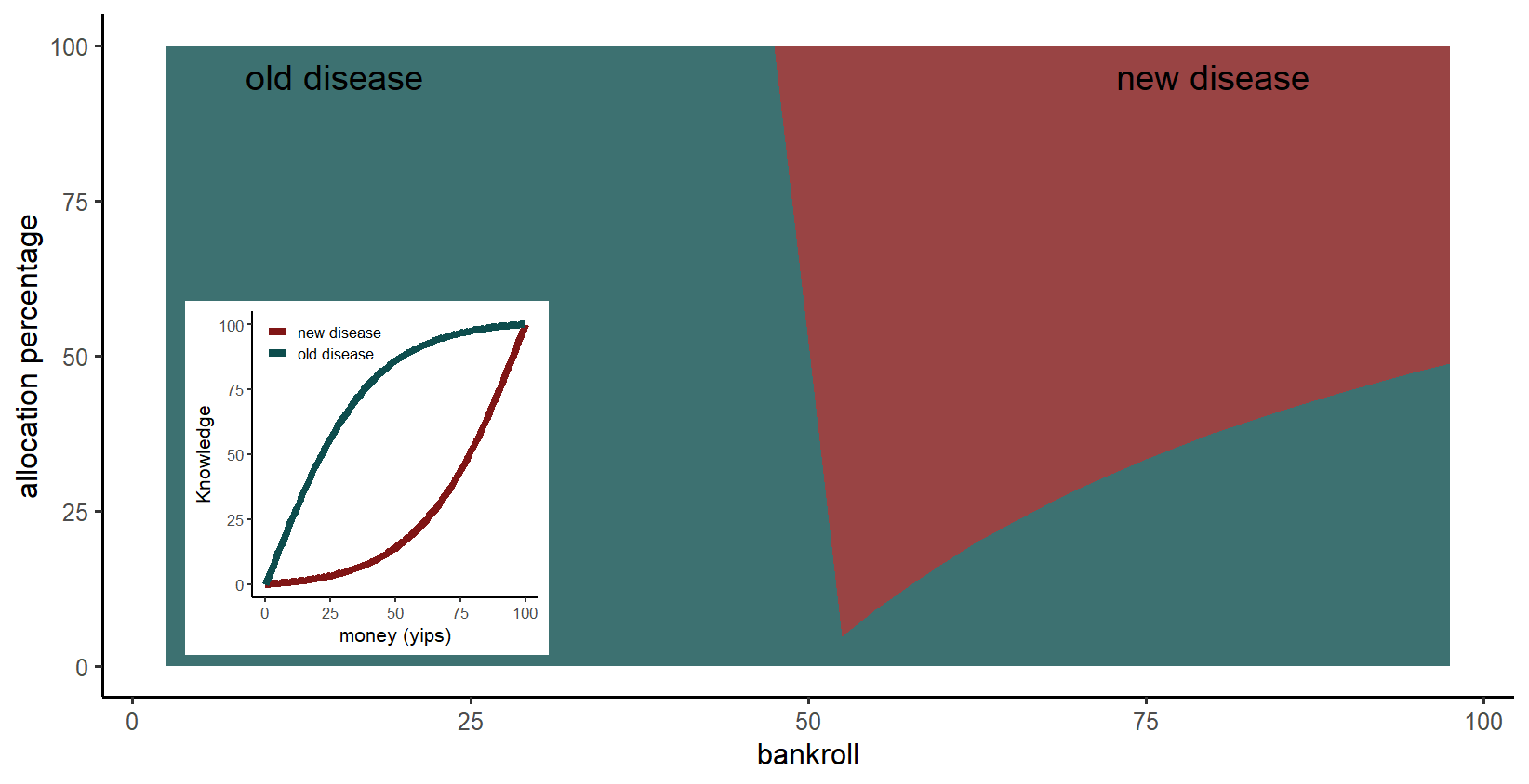
Suppose you rule a world with these two diseases, one old and one new. The currency of this world is a yip (your portrait is on each yip note, perhaps pulling a different face for different denomination). At this snapshot in time, how should you plan to allocate your yips between the two diseases?
Let’s find out with some maths and pretty plots!
I’m investigating the importance of the Age of the disease, so I will run simulations with parameter choices that highlight this effect (see the inner plot of the figure below). Specifically,
A: Both diseases have the same learning curve, but the section that is currently occupied by them is different. In reality, diseases vary, so one disease may have a longer scoping stage, or a shorter trudging stage, or any other variation. (In maths terms, changing the value for parameter a of the Sigmoidal curve.)
B: At this snapshot, the new disease occupies the scoping stage and the first half of the blooming stage. The old disease occupies the latter half of the blooming stage and the trudging stage.
The plot below presents the answer, which is in terms of the
bankroll: a percentage of the total amount of money needed to eliminate both diseases (to gain maximum Knowledge).
allocation percentage: the percentage of the bankroll allocated to each disease.
Inner plot: The subsection of the learning curve each disease occupies (see A and B above). Main plot: For a small bankroll, it is better to invest in the old diseasebecause it’s in the blooming stage, the stage where Knowledge is readily gained. In contrast, the new disease is in the scoping stage so requires an initial large investment. However, for a larger bankroll, the new disease is the priority, because the initial investment is covered and pushes the disease into the blooming stage. (Maths explanation: the critical point is when the gradient of the learning curve, within the occupied section for the old disease, is no longer steeper than the corresponding gradient of the learning curve, within the occupied section for the new disease.)
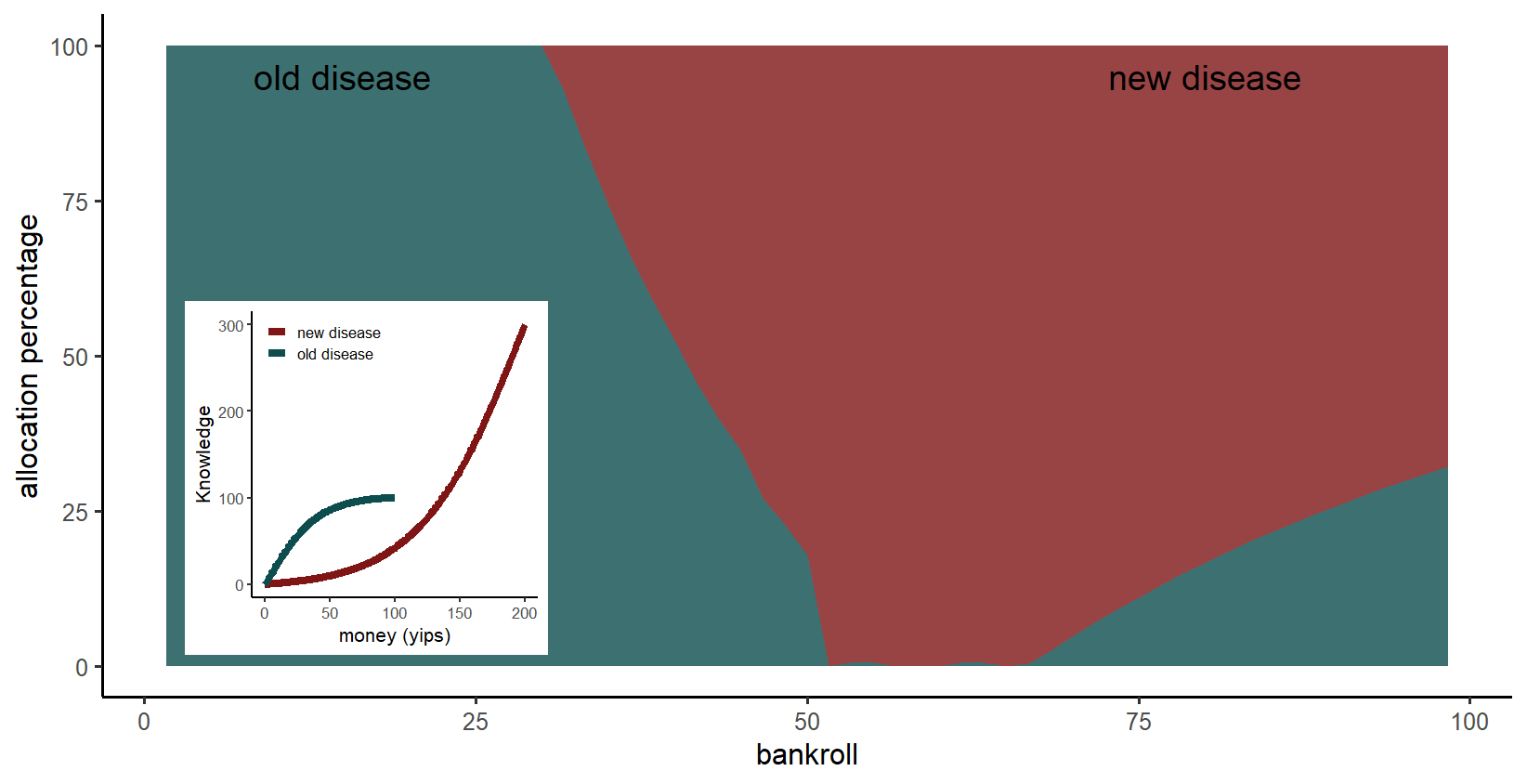
What if the new disease can affect many more people?
I ran a scenario where the new disease is more disasterous than the old disease. Specifically,
A*: the new disease requires three times more Knowledge than the old disease, and costs twice as much as the old disease to eliminate. These values reflect that Knowledge includes provision of care throughout the at-risk population, so a larger population at-risk means more Knowledge is required. At the same time, a larger population at-risk doesn’t necessarily mean the lab research is more costly, so the new disease is only two times more expensive to learn about.
Inner plot: The subsection of the learning curve each disease occupies (see A* and B above). Main plot: If the new disease is more disasterous for a small bankroll, it is still optimum to invest in the old disease because more Knowledge is gained. As before, when the bankroll is large enough, the new disease is the priority. However, now the switch to the new disease occurs for a lower bankroll.
The role of toy examples
In reality, disease management is much more complex, so fortunately we would not completely ignore a disease. This complexity can lead to benefits not discussed here, such as an overlap of returns. For example, strengthening the health system to manage an existing disease will benefit management of new diseases.
Nonetheless, this toy model demonstrates that when managing multiple diseases, where they are in their individual learning curves is relevant. That is, how readily do we expect Knowledge about each disease to be gained, and where are we in that trajectory?
Also, toy models are fun! Play with me! My R code is available on GitHub. You can add more diseases, change the learning curves for each disease, change the section of the learning curve that each disease occupies, and add noise to the learning curves. Packages used are dplyr, ggplot2 and reshape2. (Methods: The optimum percentage of the bankroll allocated to each disease was calculated using the genetic algorithm, a global optimiser. The genetic algorithm was run for each percentage of the available bankroll.)
I’m excited to announce the publication in Malaria Journal, the leading journal in malaria research,
Mechanistic within-host models of the asexual Plasmodium falciparum infection: a review and analytical assessment.
Flavia Camponovo, Tamsin E. Lee, Jonathan Russell, Lydia Burgert, Jaline Gerardin, Melissa A. Penny
The lead author is my good friend Flavia Camponovo, who was a PhD student in the same research group as me (she is now at the Communicable disease dynamics, Harvard). She had a keen interest in developing a model of the within-host dynamics of a person infected with malaria. Like any good scientist, she started collecting information about the current within-host models. However, she’s a very thorough scientist, so instead of writing a paragraph summarising the current state of research, she went much further and started reproducing a lot of the current models, coding them all in Matlab. Granted, some codes were provided, but as anyone who has tried to reproduce just one paper knows, this is a huge task! So in the way that research can take unexpected directions, reproducing and comparing current models became a paper in itself. This deep dive has been gracefully executed, thereby providing a lot more than a typical review does.
Needing to be needed
As mentioned in a previous post, for nearly two months I had to work from a campsite in a locked down New Zealand. This unique experience taught me that I’m not the type of person who produces her best work when isolated on a beautiful beach. I’ve learnt that I need a windowless cave to work hard! When I did manage to resist the lure of the sea and instead sit at my laptop, I looked at my work for 10 minutes before compulsively updating COVID stats and repatriation information. Fortunately, it was at a time when Flavia’s paper was coming together, and she sent me a copy of her paper. What motivates me is working with other people, and knowing that others depend on my input. So I engrossed myself in the paper, grateful for a tangible task. Still, I was frustrated that my lack of concentration meant I was reading each sentence two or three times. I had little faith in my comments because I was returning to work after three months off. I no longer felt like a scientist but more like a hippy traveller.
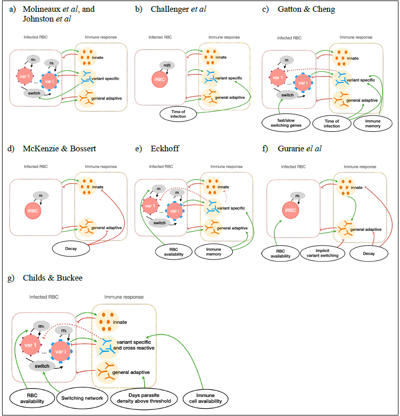
A picture is worth a thousand words
I was befuddled when she later text me a photo of a beautiful diagram she was making, which was inspired by one of my comments, also shown in her photo. As I squinted to read my comment, I didn’t recognise it. It sounded so sciency! (I was requesting information about how each model included feedback between the immune response and infected red blood cells.) I didn’t sound like a hippy whose daily routine included emptying a camper toilet and dancing in the sea. What’s more, I didn’t envision that my comment could be addressed with a diagram. Flavia took my comment, agreed with it, and addressed it using her knowledge and skillset.
What a delicious ping-pong between scientists 🙂
Schematic overview of the main within-host dynamics. A simplified representation of the main immune and parasite dynamics for different malaria within-host models.
Papers. Oh they take some time. I am pleased to announce a new paper (well newish. Published September 2020 Tropical Conservation Science). This paper started in 2018, but it’s always been a side project so I’ve struggled to make the time to make it a focus.
I am happy to finally have this off my to do list, but I’m more happy to share the work with you here. This is from work I’ve been doing with one of my favourite collaborators, Dr. David Roberts at The University of Kent.
Illegal trade of wildlife is very difficult to monitor. Fortunately this is Dave’s expertise! One approach is to find patterns in legal online trade, so we suggest an analysis that gets the most out of this data.
Maximising what we know
Our dataset is from a study of online wildlife trade which investigated the trade of Convention on International Trade in Endangered Species animals (including live animals, parts and derivatives), over 280 open online marketplaces, across 16 countries, during a six week period in 2014 (Hastie & McCrea-Steele, 2014).
Our study was considerably more extensive than usual data on legal wildlife trade, which is currently not collected with a global mindset. Instead there is a focus on the extensively traded items from countries which trade large amounts, for example, China trades ivory products and Germany trades turtles and tortoises. However, by applying some statistical analysis, we can shine a light on the less dominating behaviours.
Looking at 31 different types of wildlife products, traded by 16 different countries, we cluster the products according to their trade patterns (using hierarchical clustering in R), so products which are traded similarly are grouped together. The 31 products were grouped into eight categories, five of which grouped items which were predominately traded by one country. For example, cluster 1 contained ivory, rhino and pangolins, which are all largely traded by China. During the time period of the dataset, 1662 ivory items were traded by China, but only 164 rhino items, and a measly 3 pangolins. With this distribution, it is understanding that reports tend to focus on the ivory items. However, by grouping them together, one can make assumptions about the illegal trade of all of these items for the price of one!
Other products do not have a strong association with a particular country (from our list of 16 countries). These products were exotic birds, primates, otters, antelopes, red panda, conches, cats, crocodiles and alligators, foxes, bears and whales, see the figure below. Therefore monitoring the illegal trade of these items would require surveillance in many countries.
Voice and Accountability
Returning to the five clusters which contain wildlife items that were traded by a dominating country. These countries were China, Germany, the Netherlands, the UK, and Poland. (The trade of items from the other three clusters were not dominated by a particular country.) Ordinating these clusters we looked for a relationship between the items traded and Worldwide Governance Indicators, which are six measures for each country that include factors such as control of corruption and government effectiveness.
These indicators come with controversy, of course! I personally find them nice measures for understanding the world. They are defined here (Kaufmann et al., 2010). We found a correlation between the items traded and the ‘Voice and Accountability’ score for each country. The ‘Voice and Accountability’ captures perceptions of the extent to which a country’s citizens are able to participate in selecting their government, as well as freedom of expression, freedom of association, and a free media. So using this correlation (not causation!) we can make trade predictions for countries not included in our data. For example, comparing the Voice and Accountability score for the United States (a country not included in our dataset), with the average Voice and Accountability score for the clusters, we infer that the United States traded elephant items (not ivory) and owl items during 2014 (items from cluster 6).
What pets do you have?
Sharing the results of this paper with my international colleagues was fun, as my German and Dutch colleagues learnt that Germany and the Netherlands hosts Europe’s largest reptile trade shows, Hamm Terraristik (as well as its associated online trading platform) and Terraria-Houten. As my Dutch colleague said, “I don’t know anyone with a pet turtle…”. I guess she’s not asking the right questions at parties.
I love this figure, but getting a colour figure printed is expensive. So I’m happy to have the chance to share it here 🙂 The items in each cluster, and the number items from each cluster that were traded, are 1: ivory and suspected ivory, rhinoceros, pangolins (3222); 2: turtles and tortoises, snakes, giant clams, stony corals (2256); 3: exotic birds, primates, otters (2236); 4: cats, crocodiles and alligators, antelopes, conches, red panda, other (689); 5:amphibians, birds of prey, lizards, sharks, seahorses, hippopotamuses, walruses (615); 6: owls, elephants – not ivory (301); 7: bears, whales, foxes (106); 8: wolves, sturgeons, fish (45).
My last blog post, I announced that I was awarded the Marie Curie Individual Fellowship from the Horizon 2020 fund from the European Commission. And I promised to give details about the actual project. Et voila!
Antimicrobial resistance
You’ve probably heard of antibiotic resistance? It’s when the bacteria that’s caused an infection in someone is resistant to the treatment used to kill it off. It’s scary stuff. It’s not just bacteria that develops resistance to treatment. Viruses and parasites and fungi do too. The umbrella term is antimicrobial resistance (AMR). And AMR is a big deal! When a treatment stops working, morbidity and mortality from the disease goes up. New drugs need to be developed, which takes a lot of time and money. And even if new drugs were as easy to develop as a new tea flavour, to be effective to the resistant strain, the new drugs are often more toxic, leading to harsher side effects. And often the new drugs are more expensive, which can make them inaccessible to many patients. The consequence of AMR are so far reaching, that addressing AMR will help 6 out of 17 of the Sustainable Development Goals set by WHO.
What makes a microbe develop resistance? Nature. Consider a sick person, and the offending microbe is multiplying like crazy within this person. Mutations of the microbe occur all the time, and VERY occasionally some of these mutations will lead to a resistant strain. When the settings favour this resistant strain, such as when the sick person gets treatment which kills off all other strains, the resistant strain has an evolutionary advantage. The sick person remains sick. And the infectious disease continues to spread. The resistant strain of it. Dun dun dunnnn…
Drug resistance in low to middle income countries.
To prevent drug resistance, treatment needs to be effective and the full prescribed course of treatment needs to be completed. However, this can be difficult to monitor, especially in low to middle income countries where health care access may be limited. For example, someone may feel better after a few days of treatment, and save their medicine for a family member who has the same symptoms. Or perhaps treatment is cheaper from a family friend with boxes of cheap (presumably counterfeit) drugs. These factors are known to promote drug resistance occurring and spreading.
Monitoring drug resistance spreading
Consider malaria, a parasitic infection. The latest treatment used to combat malaria is artemisinin. Like all antimalarials that came before artemisinin, drug resistance to this treatment starts in South East Asia. When drug resistance malaria infections occur in Africa, where malaria prevalence is very high, the tragedy rapidly escalates. Consequently, drug resistance is monitored globally. The map below is from many molecular marker studies, beautifully collated together by WorldWide AntiMalarial Network (WWARN). These studies take samples from infected people and identify whether the malaria parasite within them has mutations which are associated with resistance to treatment.
The presence of mutations associated with malaria which is resistant to the latest antimalarial treatment.
My project – the science bit
To demonstrate my project, consider a toy example in Square Land over 20 years. Within Square Land you have sampled infected people, at different locations and times, and identified whether they carry a resistant strain or not (like the WWARN data above). In addition, suppose you know the location of five treatment access points, such as health care centres or hospitals. The first and last year look like this.
A red square means that at that location and time, there is at least one infected person carrying a resistant strain (yi = 1). A blue square means that at that location and time, there were no sampled people carrying a resistant strain (yi = 0). We see that there are more resistant infections (red squares) around the treatment access points (black circles), but we cannot identify which ‘hot spot’ is contributing more resistance into the population.
The black circles are the treatment access points. A red square means that at that location and time, there is at least one infected person carrying a resistant strain (yi = 1). A blue square means that at that location and time, there were no sampled people carrying a resistant strain (yi = 0). In total there are N data points (y1, y2, … , yi, … , yN), collected over the 20 years. The ‘true’ number of people carrying a resistant strain will be greater, this is only the collected data. In other words, each data point yi has a probability pi of being a 0 or 1, where pi depends on the true density of people infected with a resistant infection at that particular location and year, ui, and a probability of being sampled. The sampling probability depends on demographics about the person, such as their age.
The true number of people with a resistant infection at a particular location and year, ui, is unknown. However, we assume some basic knowledge about the underlying processes which determine this truth. That is, we assume that the true number of people with a resistant infection at a particular location and year, ui, depends on (1) the number of people with resistant infections in the neighbouring regions, and (2) the number of people with resistant infections at the particular location during the previous year. Both of these components depend on the prevalence of the disease in general. Processes (1) and (2) are standard assumptions regarding species spread – dispersal and growth. I added a third process which is specific to drug resistant infections: (3) new introductions of the resistant strain – which is an underlying spatial component that states there is more chance of having a resistant strain when close to a ‘hot spot’, where each hot spot has a different magnitude of resistant infections that it contributes into the population. For simplicity, in this example, I previously stated that all these hot spots are treatment access points, however one or more of them could be a transport hub such as train station or airport. Also, for simplicity, I’ve assumed that we know the location of the hot spots (however this isn’t a requirement of the method).
With some *mathemagic*, we can identify that the treatment centre at the top is contributing the most resistant infections into the population. It would be worth investigating the quality of their drugs and/or the adherence of the patients.
Using Monte Carlo Markov Chain with uninformative priors (translation: using powerful statistical tools combined with computing power and assuming no previous knowledge – which could introduce biases), we can identify which hot spot is contributing more resistance to the population and target strategy accordingly. In this example, we identified that the top left hot spot contributes the most resistant infections into the population. Therefore, if this hot spot was a health care centre, it would be worth investigating the quality of the drugs administered here and/or the adherence of the patients. If this hot spot was a transport hub, it would inform us that drug resistance is entering the population from outside.
Some of you may be disappointed that I haven’t presented the beautiful equations that describe this whole process. If you want all the juicy details, feel free to reach out or peruse a recent presentation I gave at the Research Center for Statistics at the University of Geneva, available here.
I’ve had a varied research background (see previous blog post: From electricity to malaria). This meant that from my PhD, I’m familiar with partial differential equations (used here to model the mechanisms of the true number of people with a resistant infection at a particular location and year). From working with ecologists, I’m familiar with Bayesian hierarchical models being used to model animal movement, which formally accounts for uncertainty in the data . And from working with epidemiologists, I’m familiar with drug resistant malaria. Put it all together…. and what do you get!? I believe the first time that this type of model is applied to understand the spatio-temporal mechanics of AMR in a population.
An snippet from my application for the Marie Curie Individual Fellowship from the Horizon 2020 fund from the European Commission. Some bold claims… No wonder why they had to award me!
My goodness! It’s been over a year since my last post?! I’d question what happened, but I think we all understand that 2020 has done funny things with our perception of time.
The hiatus is particularly long on my part because I took three months leave to travel New Zealand, and then I got stuck for an extra two months on a campsite during lockdown – not knowing when and how I would get back to Europe. Although even without a proper toilet and shower, there are worse places to have a lockdown than a friendly campsite that has direct access to a beach…
Upon my return it’s been a series of unfortunate events. Each one on it’s own devastating, but not unbelievable. However, the sheer rate of these events was unbelievable. This series taught me that in order to move forward, I have to meet my reality where my reality is.
So in the spirit of acceptance, I am finally ready to admit to myself, and the internet, some amazing news which I’d been scared to share because I couldn’t believe it…
The funding supports talented (and lucky) individuals to work on a research project of their choice for two years. Like all research funding, the proposed project must be state-of-the-art yet achievable. The Marie Curie fellowship stands out because there is a strong focus on supporting the development of the fellow so that by the end of the two years I’ll be captivating you with my dazzling-brain and eloquent explanations… These expected achievements seem unbelievable but hopefully it will become a reality that I’ll meet 😉
This success is due to the incredible support from Prof. Melissa Penny, and a jar of fancy peanut butter with agave syrup and cinnamon.
What’s the actual project? Next blog post coming in the next few weeks… (Provided no more unfortunate events!)
A beautiful illustration by a campsite lockdown buddy.