
I admire clean visualisations that are scientifically robust. I’ve completed several courses about communicating science and learnt a few tricks. Did you know that the human eye has trouble discerning the difference between angles? But as much as pie charts can irk me, I acknowledge that, when with two to three colours, a row of them can make a report look punchy. This relates to a wider lesson.
Communicating science in our attention economy
I adore seeing years of effort succinctly presented in a good plot in a journal. The authors may have highlighted the important parts, and it’s like unlocking a beautifully wrapped present of information. It can be art! However, to make science impactful, we need to make it bold, clear, and flexible to varying needs.
Instead of trying to cram as much information into one plot to meet the figure limitation of a journal, I now try to make information jump out immediately! Sometimes it’s better to show three bar graphs than one complicated plot that needs 10 minutes of explanation. So it’s no wonder that interactive dashboards are all the rage.
Does this make me an annoying friend?
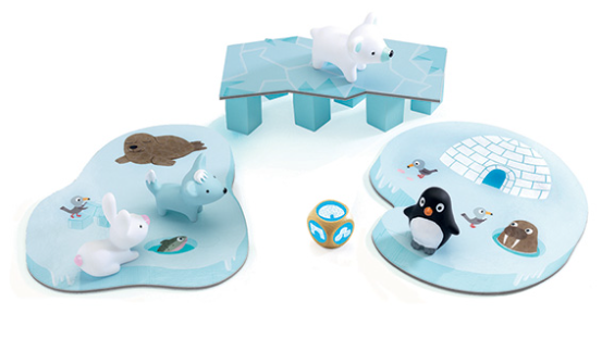
I was playing a game of Litte Cooperation with a friend’s 2.5 year old. This game is so cute! I quickly became more excited than the child. There are four animals on one patch of ice. They need to first go to the bridge, and then to the second patch of ice. Players take turns to roll a die which either (i) moves an animal from the first block of ice to the bridge (ii) moves an animal from the bridge to the second block of ice or (iii) ‘melts’ (remove) a pillar from the bridge. All three options are equally likely (two sides on the die each). I wanted to learn what the chances of winning are. And why keep this to myself?!?! Let’s hound my friends with all the possible options should they lose/remove pieces. Here is the dashboard, and screenshots below. The probability of winning, with all pieces, is 0.36; and winning games take, on average, one roll of the die longer.
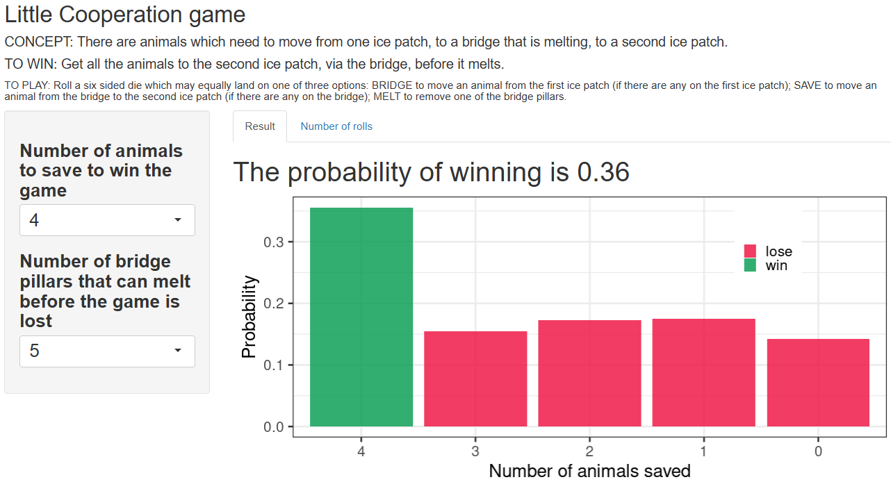
Screenshot from dashboard: https://52yvwr-tamsin-lee.shinyapps.io/LittleCooperation/ Code at https://github.com/TamsinELee/LittleCooperation/blob/main/app.R
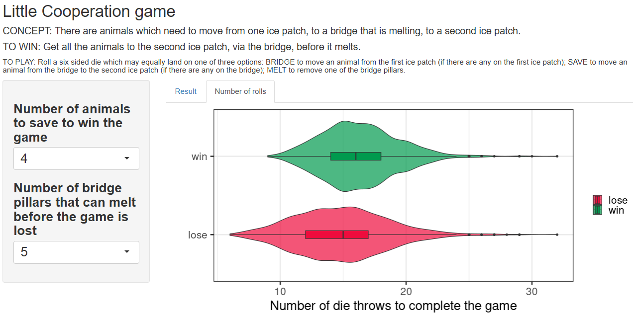
Screenshot from dashboard: https://52yvwr-tamsin-lee.shinyapps.io/LittleCooperation/
Other dashboards
- How finance indicators correlate with disease incidence and mortality (accounting for a lag between the finance indicator and the epidemiological outcome).
https://52yvwr-tamsin-lee.shinyapps.io/TB_financeIndicators/
https://52yvwr-tamsin-lee.shinyapps.io/HIV_financeIndicators/
https://52yvwr-tamsin-lee.shinyapps.io/malaria_financeIndicators/ - Visualisation of movement of people between regions
https://52yvwr-tamsin-lee.shinyapps.io/Pablo_initialPlay/ - Pharmaceutical portfolio strategy and analysis
https://52yvwr-tamsin-lee.shinyapps.io/PharmaPortfolio/ - Ranking pharmacies according to different traits.
https://52yvwr-tamsin-lee.shinyapps.io/PharmaRank/ - Aggregating opinions for forecasting questions.
https://52yvwr-tamsin-lee.shinyapps.io/FRI_opinionPooling/ - Estimating the number of health care facilities in sub-Saharan Africa.
https://52yvwr-tamsin-lee.shinyapps.io/estimate_nHealthCareFacs/
If you wish to discuss how we could use a dashboard to present your data clearly and informatively, please contact me on LinkedIn.
