
Imagine there’s a new disease. Quickly, stock up on loo roll! But whilst we panic, the powers that be throw money at the problem (whilst, presumably, also panicking). Then knowledge grows and miracles happen.
Miracles happen because we invest in learning
The ‘learning curve‘ is the line that shows how knowledge increases with experience. For this blog post, I’m going to replace ‘experience’ with money, meaning that as more money is invested, more knowledge is gained. (In maths terms, “For disease management, assume experience is proportional to the amount of money invested”.)

The Knowledge here (capital K) ranges from all scales of understanding that is needed to eliminate a disease: from the small biology stuff, to the development and production of tests, treatments, and vaccines, to mathematically modelling individuals’ behaviour, to delivery of equipment and medicine, and to provision of care throughout the at-risk population. The goal is to obtain aaaallll the Knowledge (maximum Knowledge). (Maths note, Knowledge is a dimensionless parameter, where the relevant aspects are its relationship to investment, and the comparisons of the maximum Knowledge between the different diseases.)
For this toy example, I’m looking at a snapshot in time so I exclude anything that changes with time, such as new variants. Even with this simplification, managing diseases is already complex. But in 2022, I doubt this is news to anyone.
The learning curve above has three stages
- 1. Scoping: A lot of money is needed, with relatively little returns. There is a lot we don’t yet know.
- 2. Blooming: Things are rolling, and investments return a lot of Knowledge. We’re feeling bloomin’ good!
- 3. Trudging: There’s diminishing returns on investments. This last slog can make it difficult to justify further investment, especially as the number of diseased people would have decreased rapidly thanks to the blooming stage. However, without trudging through this final stage, diseases can resurge, and thus cost more in the long run.
The new disease occupies the scoping stage of the learning curve. Whereas an older disease is past this stage, and occupies a region that may encompass the last, trudging stage. So at a snapshot in time, the ‘Age’ (capital A) of a disease is an indicator of how close we are to having the disease under control (from herein, I’ll refer to this ideal point as eliminating the disease).
Where to invest?
Suppose you rule a world with these two diseases, one old and one new. The currency of this world is a yip (your portrait is on each yip note, perhaps pulling a different face for different denomination). At this snapshot in time, how should you plan to allocate your yips between the two diseases?
Let’s find out with some maths and pretty plots!
I’m investigating the importance of the Age of the disease, so I will run simulations with parameter choices that highlight this effect (see the inner plot of the figure below). Specifically,
- A: Both diseases have the same learning curve, but the section that is currently occupied by them is different. In reality, diseases vary, so one disease may have a longer scoping stage, or a shorter trudging stage, or any other variation. (In maths terms, changing the value for parameter a of the Sigmoidal curve.)
- B: At this snapshot, the new disease occupies the scoping stage and the first half of the blooming stage. The old disease occupies the latter half of the blooming stage and the trudging stage.
The plot below presents the answer, which is in terms of the
- bankroll: a percentage of the total amount of money needed to eliminate both diseases (to gain maximum Knowledge).
- allocation percentage: the percentage of the bankroll allocated to each disease.
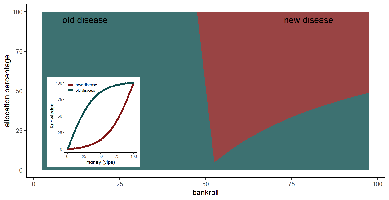
Main plot: For a small bankroll, it is better to invest in the old disease because it’s in the blooming stage, the stage where Knowledge is readily gained. In contrast, the new disease is in the scoping stage so requires an initial large investment. However, for a larger bankroll, the new disease is the priority, because the initial investment is covered and pushes the disease into the blooming stage. (Maths explanation: the critical point is when the gradient of the learning curve, within the occupied section for the old disease, is no longer steeper than the corresponding gradient of the learning curve, within the occupied section for the new disease.)
What if the new disease can affect many more people?
I ran a scenario where the new disease is more disasterous than the old disease. Specifically,
- A*: the new disease requires three times more Knowledge than the old disease, and costs twice as much as the old disease to eliminate. These values reflect that Knowledge includes provision of care throughout the at-risk population, so a larger population at-risk means more Knowledge is required. At the same time, a larger population at-risk doesn’t necessarily mean the lab research is more costly, so the new disease is only two times more expensive to learn about.
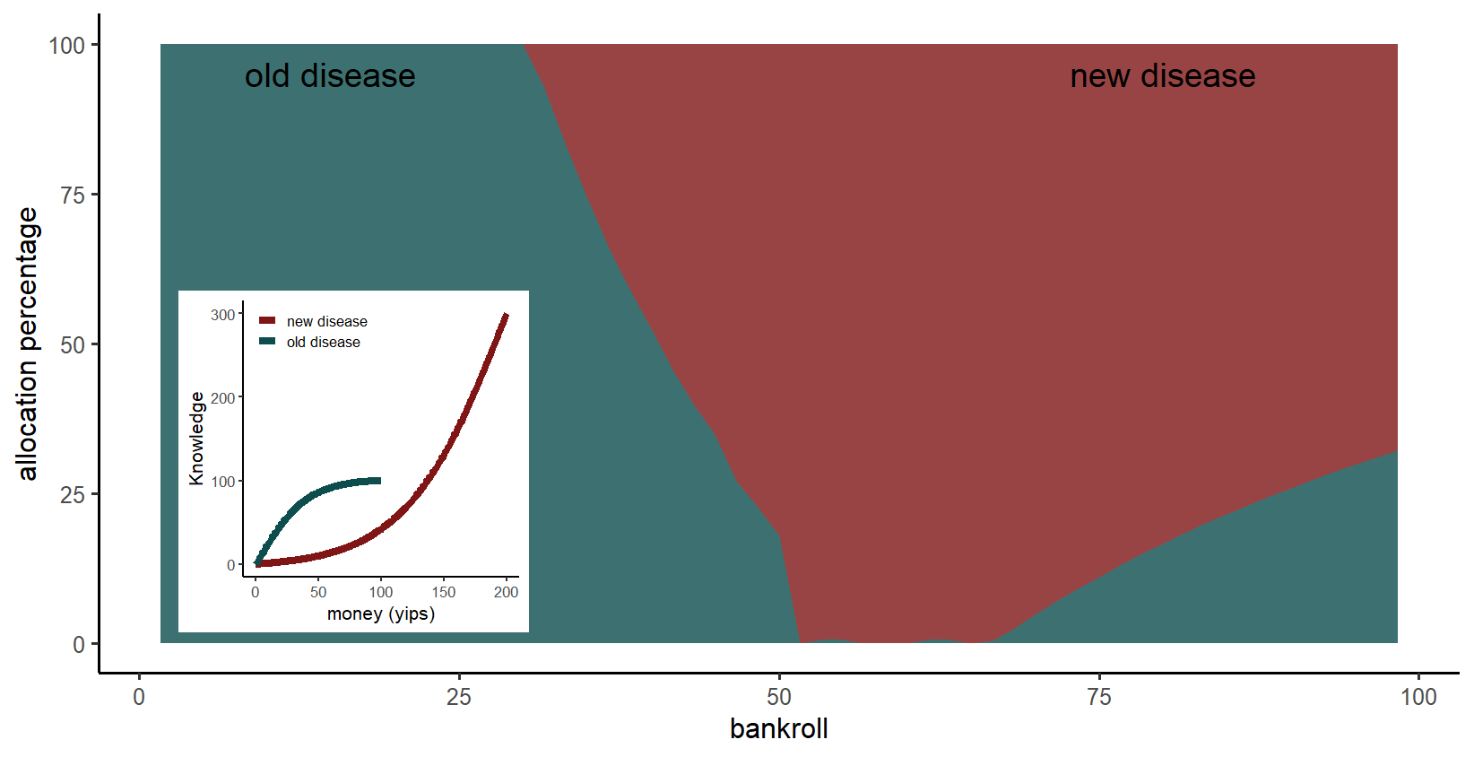
Main plot: If the new disease is more disasterous for a small bankroll, it is still optimum to invest in the old disease because more Knowledge is gained. As before, when the bankroll is large enough, the new disease is the priority. However, now the switch to the new disease occurs for a lower bankroll.
The role of toy examples
In reality, disease management is much more complex, so fortunately we would not completely ignore a disease. This complexity can lead to benefits not discussed here, such as an overlap of returns. For example, strengthening the health system to manage an existing disease will benefit management of new diseases.
Nonetheless, this toy model demonstrates that when managing multiple diseases, where they are in their individual learning curves is relevant. That is, how readily do we expect Knowledge about each disease to be gained, and where are we in that trajectory?
Also, toy models are fun! Play with me! My R code is available on GitHub. You can add more diseases, change the learning curves for each disease, change the section of the learning curve that each disease occupies, and add noise to the learning curves. Packages used are dplyr, ggplot2 and reshape2. (Methods: The optimum percentage of the bankroll allocated to each disease was calculated using the genetic algorithm, a global optimiser. The genetic algorithm was run for each percentage of the available bankroll.)
